• Refreshed June 1, 2022


    ---Color---

    • Color wheel - Red, Orange, Yellow, Green, Blue, Indigo, Violet - all those colors are arranged in a circle.
    • Primary Colors - Red, Yellow, Blue;  The three most important colors on the color wheel.  They mix to give us every other color available. 
    • Secondary Colors - Orange, Purple, Green; The next most important set of colors - achieved by mixing 2 primaries together.  R+B= Purple, R+Y = Orange, Y+B= Green
    • Warm Colors  - Red, Orange and Yellow - Colors that look warm and your mind should be able to see that the picture looks warm.  These colors might remind you of warm things.
    • Cool Colors - Blue, Green, Purple - Colors that look cool/cold and your mind should be able to see that the picture looks cold.  These colors might remind you of cold things.
    • Complementary Colors - Colors that are across from each other on the color wheel.  When used together, the image usually looks good;  They make brown when mixed.   
                                               --  Pairs of Complementary Colors are Blue/Orange (most common), Yellow/Purple, Red/Green.
    • Hue - One version of a color.  Example: There's Brick Red, Salmon Red, Strawberry, and several other Reds, including actual Red - with nothing done to it (And it's the most important Red there is)


    ---Elements of Design  (The stuff you use to make the picture look good)   

    • Line -One of the elements of art.  Lines are everywhere and they give us shapes.
    • Form - One of the elements of art.  When a shape has form, it either looks like it occupies space or the artist created a tangible, physical shape and it does take up space and have form.
                           Making a 2D shape look 3D, by making it appear to have form is achieved through shading and controlling the shadows.
    • Shape - An area with a defined boundary;  A shape, circle, square, rectangle, etc. 
    • Texture - Real texture is how something feels to our sense of touch;  Texture is the surface of an object.
    • Space - Can mean an open space, or on a blank piece of paper its a spot on the paper that either needs something added or removed.  Sometimes it means that the viewer has a sense of how a space is when it is drawn.
    • Value - How light or dark an object is.  Bright is high key, Dark is low key, Grays are mid-tones.
    • Color - Color is a wavelength of light.  In art it is something we add to an artwork.  There are too many reasons for adding color to list here.
    •  

    -- Principles of Design  (How you arrange stuff on the page)

    • Balance - Balance is when an image looks like it will not tilt to the left or the right.  It looks balanced.
    • Repetition - When objects, lines, shapes, colors or any part of an image repeats.  The repetition is usually at least 3 times for a pattern.
    • Pattern - Part of an image that repeats at least three times.  This could be a shape, a group of shapes, a line, or many other things.


    --Words students and pros use to talk about art

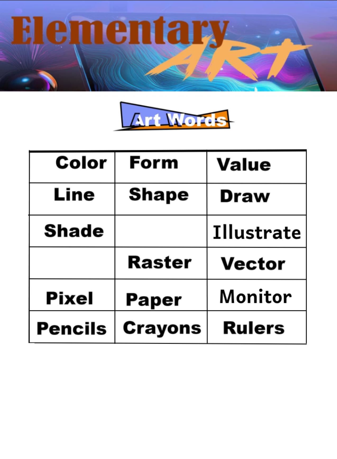
    • lllustration - an image or picture created with crayons, pencil, marker, paint, charcoal, or several other media.
    • Paper - What people normally draw or paint on.  Types = Copy, Drawing, Bristol, Tracing, Parchment, Construction, and some specialty papers.


    • Crayons - Wax, pigment and binders.  Normally used for drawing and coloring.  Very Versatile and can be used on any kind of paper.

    • Clay -  Air dry = play dough, model magic, and Das.

    • Symmetry - When the left side of the picture (left to the middle of the page) is the same as the right side (from the middle of the page all the way to right edge)
    • Asymmetry - When an image is NOT the same on the left and the right.

    • Contrast - Being able to see what is happening in the image.
    • High Contrast - In black and white images, it is pure black and white.  In color images, it means you can see what is going on.
    • Low Contrast – In black and white images, it is black, white and gray.  In color images, it’s a lot of the same color used everywhere.  Sometimes hard to see stuff.

    • Value Chart - A chart that separates values, usually white is on last "value" on the left, and black is the last value on the "right", with varying shades of gray in between.  A simple value chart has 3 values: White, Gray, Black or VERY dark gray.

    • Geometry - The study of Shapes

    • Perspective – Making a 2D object look 3D.  Requires a horizon and a vanishing point.  Really helps to have a ruler too.
    • Horizon Line - Usually, in a picture, where the sky meets the ground (or skyline, or lake, or whatever it happens to meet).  Usually called "eye level"